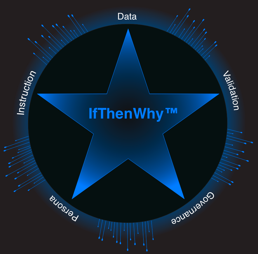
IfThenWhy™ Home of the Tableau at Work book series and IP framework for data analytics


“Tell me and I forget, teach me and I may remember, involve me and I learn.”
-Benjamin Franklin
IfThenWhy™ Home of the Tableau at Work book series and IP framework for data analytics

In this step-by-step hands-on data forensic investigation, we dive into root-cause analysis using Tableau. See if you can spot data bias, bypass misleading vanity metrics, and learn the difference between correlation and causation.
Data doesn’t have a single author; it has a committee of perspectives for how a metric is collectively defined. This example leverages the Data Mapping Files to provide a logic review in real-time from the viewpoint of each persona involved, and demonstrates the clear deterministic intent outlined in the data mapping files.
In this two-part series, we walk through the hands-on process of building four distinct Tableau histograms. Once the technical work is done, we leverage AI to tell the story, using Google Gemini to help interpret the distributions and uncover the "why" behind the data.
Building an AI-First Data Architecture (starting with Tableau)
The biggest hurdle for AI in the enterprise isn't the algorithms—it’s the meaning.
If you ask an AI, "What happened to sales?" it can look at the data. But if you ask, "Why are our 3-month rolling averages dipping?" the AI needs more than just a table; it needs to understand the Semantics of that calculation.
I’m using a four-tier metadata framework to bridge the gap between "Raw Code" and "AI Intelligence." This isn't just about documenting for humans; it’s about creating a machine-readable map of Business Intent.
Create a Tableau KPI Dashboard with Current Month performance, calculating a rolling 3-Month Average and a comparison to the previous month.
A comprehensive, 15-chapter roadmap designed to build a strong technical base in data visualization. Free to use, free to learn.
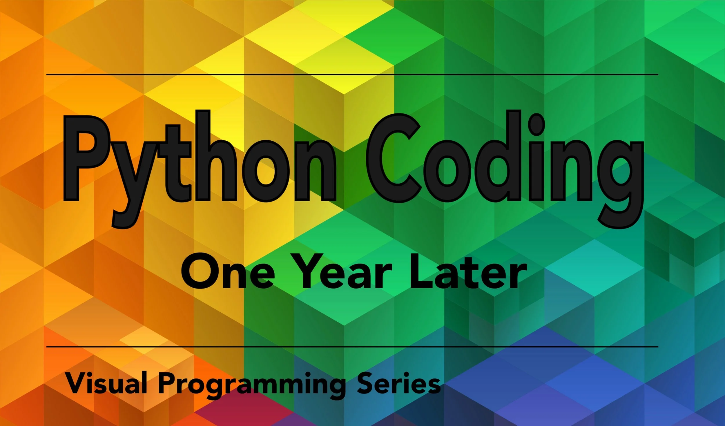
If you’re relying on Python to clean, transform, and aggregate your messy source data, you need to be absolutely certain your scripts are robust, fast, and, most importantly, error-free.
Download my foundational coding guide: Python Coding One Year Later—for free! The focus is on fundamentals and debugging examples.
This challenge isn't about complex formulas; it's about the high human cost of poor data ethics and bias.
Ditch boring tutorials—challenge yourself with a fun game, the ultimate way to master data skills! Dive into live workbooks for every question to test your solution, or follow the "Clues" for a guided path to conquer the puzzle.
In this inquiry-oriented challenge, follow your own path to explore the data clues and solve the case.
Ready to build the dashboards that get noticed? This high-level video explores the Fun Fab Five - 5 essential concepts that unlock advanced visualization: Filters, Aggregation, Level of Detail (LOD) calculations, Parameters, and Actions/Tooltips.
In this video, we'll explore the fundamental roles your data fields play, from Dimensions and Measures to the famous Blue vs. Green distinction of Continuous and Discrete fields.
Over the years I’ve created dozens of icons to use in my work. Explore and/or download the icons and let me know your favs.
Start your journey by learning the application's fundamental language so you can effectively get help and ask questions.
Watch as I turn traditional pie charts into a donut chart, giving your data a fresh new look!
I'll show you how to take that one humble float value and magically morph it into a sleek text string .
This video introduces my completely free training website, packed with everything you need to become a data visualization pro!
Create custom date calculations for nuanced insights, or utilize Level of Detail (LOD) expressions to analyze data across different time granularities.
Master Tableau Mark Labels to display data directly on your marks, or customize Titles with field data and avoid “All”
In this leisurely stroll through Tableau formatting, we’ll look at headers, axes, lines, colors, & text.
Walk through a Tableau example, using data, worksheets, and dashboards to craft a compelling narrative.
Have you wondered how to connect to multiple data sources or how to create a relationship?
Learn how to create a Box and Whisker Plot from scratch in Tableau. Dive deep into understanding the whiskers, distribution bands, and what they reveal about your data.
“Tell me and I forget, teach me and I may remember, involve me and I learn.”
-Benjamin Franklin
Check out the latest Viz Whiz - Case 13