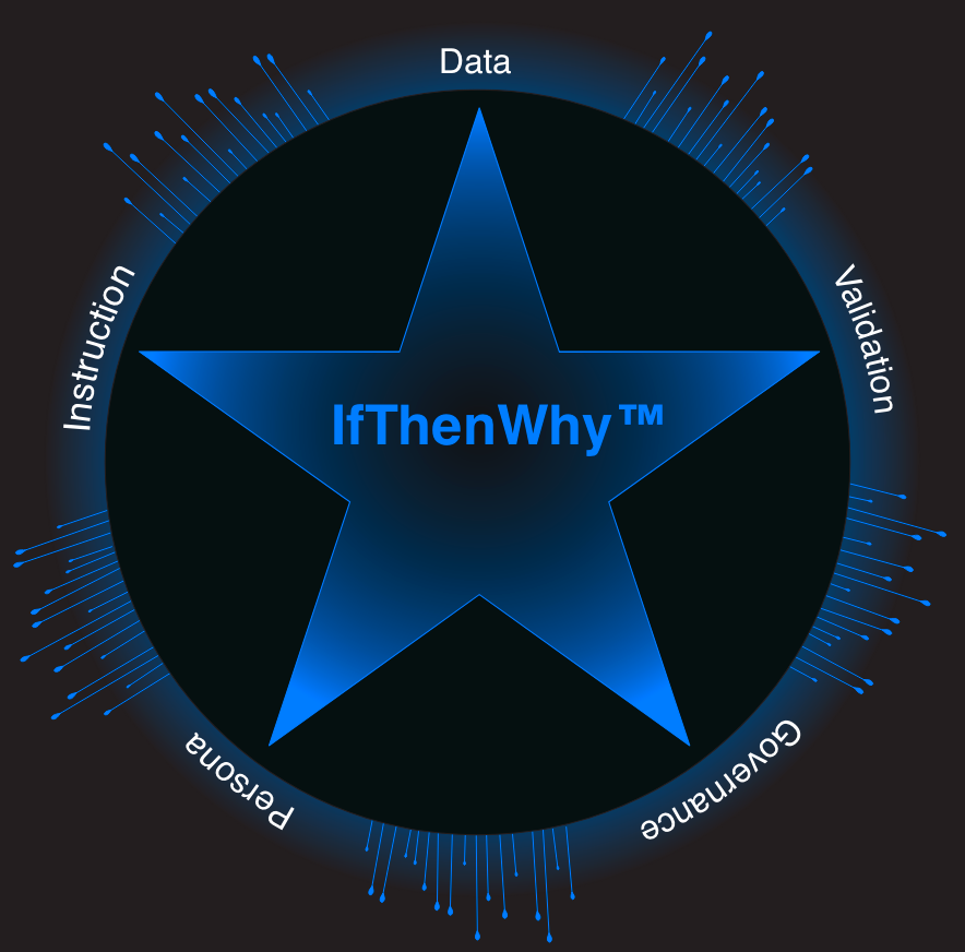
IfThenWhy™
Exercises
All exercises on this website are approved for academic use under CC BY 4.0. Please cite as: Young, C. (2025). Tableau at Work. CRC Press.

Video transcripts underway! Full accessibility for this video series expected by Jan 31.
-
![]()
The Defect Detective
In this step-by-step hands-on data forensic investigation, we’ll dive into root-cause analysis using Tableau. This is an intent-based exercise where you follow your own pace. See if you can spot data bias, bypass misleading vanity metrics, and learn the difference between correlation and causation.
-
![]()
Nothing in Common
This example leverages the Data Mapping Files to provide a logic review in real-time from the viewpoint of each persona involved, and demonstrates the clear deterministic intent outlined in the data mapping files.
-
![]()
Histograms
In this two-part series, we walk through the hands-on process of building four distinct Tableau histograms. Once the technical work is done, we leverage AI to tell the story, using Google Gemini to help interpret the distributions and uncover the "why" behind the data.
-
![]()
KPI Dashboard
Create a Tableau KPI Dashboard with four different worksheets. We’ll build a logic-driven view that tracks your Current Month performance, calculates a rolling 3-Month Average, and provides a direct Month-over-Month (MoM) Comparison.
-
![]()
The Accidental Analyst
Explore data to uncover new insights.
-
![]()
Quiet Quitting
This challenge isn't about complex formulas; it's about the high human cost of poor data ethics and bias.
-
![Image of a desk with two wide monitors displaying golden mountains for the Drop-down Sheet Selector exercise. Video tutorial included with full text transcript.]()
Drop-down Sheet Selector & Dynamic Zones
Create a dashboard that navigates between three different views and corresponding filter controls.
-
![Image of a black ball inside a group of red balls for the Filter the View exercise. Video tutorial included with full text transcript available below.]()
Filter the View, not the Underlying Data
Filter the view but still use all the data in calculations
-
![]()
The Case of The Flocking Flamingos
In this inquiry-oriented challenge, follow your own path to explore the data clues and solve the case.
-
![An image of red pagodas for the Sheet Selection Exercise. Video tutorial included with full text transcript available below.]()
Level of Detail Expressions
Explore how totals change with different level of detail expressions.
-
![An image of blue thread looped around creating a loose knot for the Sheet Selection menu exercise. Video tutorial included with full text transcript available below]()
Sheet Selection Menu
Use a parameter as a “menu” to switch between two worksheets.
-
![]()
The Fun Fab Five
Ready to build the dashboards that get noticed? This high-level video explores 5 essential concepts that unlock advanced visualizations: Filters, Aggregation, Level of Detail (LOD) calculations, Parameters, and Actions/Tooltips.
-
![]()
The Blue vs. Green Tableau Scene
In this video, we'll explore the fundamental roles your data fields play, from Dimensions and Measures to the famous Blue vs. Green distinction of Continuous and Discrete fields. We'll show you how this foundational understanding impacts your visualizations and even cover how to assign geographic roles to your data to create powerful maps.
-
![]()
The Tableau Workspace
Feeling lost in Tableau? Start your journey by learning the fundamental language of the application so you can effectively get help and ask questions.
-
![]()
Beyond Pie: Donut Charts
Ready for a sweet Tableau treat? Watch as I turn traditional pie charts into a donut chart, giving your data a fresh new look! This video guides you step-by-step through creating a visualization that clearly highlights total sales and the percentage of total sales, all thanks to a clever Level of Detail (LOD) expression. Get ready to make your dashboards irresistible!
-
![]()
Float Field Freedom
Have you ever been here? Your audience wants you to transform a float field into a dozen different outputs. You might wonder, "Can I do it?" The answer is a resounding "Yes, I can!"
-
![]()
Reverse Engineer Tableau Charts: A Step-by-Step Guide
Browse Tableau Public to find a visualization that catches your eye. Look for something that appears complex, visually appealing, or uses a chart type you'd like to learn more about. Learn how to analyze the Fields (dimensions, measures, and calculations) and uncover the secrets of the Marks Card (color, size, labels, and tooltips) to truly understand how compelling visualizations are built.
-
![]()
Tableau Time: Date Driven Filters & Calculations.
Learn how to effectively visualize project timelines with date ranges in Gantt charts, create custom date calculations for nuanced insights, utilize Level of Detail (LOD) expressions to analyze data across different time granularities, and master date filters to focus on specific periods.
-
![]()
Titles, Labels, Annotations, & Headings
Master Tableau Mark Labels to display data directly on your marks, customize Titles with field data, avoid “All”, understand Headings in tables, and add headings for Text tile fields.
-
![]()
Apply Filters Button
Learn a simple yet powerful Tableau trick to streamline your analysis! Discover how to implement "Apply Filters" and "Reset Filters" buttons.
-
![]()
Formatting
In this leisurely stroll through Tableau formatting we’ll look at headers, axes, lines, colors, & text. We’ll customize visuals with shading, borders, and number formats.
-
![]()
Crafting Impactful Insights Through Storytelling
This exercise explores the creation and presentation of compelling data narratives, framing the process as a journey from initial questions to actionable outcomes, such as solutions, opportunities, or well-informed decisions.
-
![]()
From Mess to Minimalist
This example uses LOD and table calculations to find an employee’s weighted percent of goal.
-
![]()
Connect to Multiple Data Sources
In this exercise, we begin with a default relationship with two connections. Next, we explore joins and look at the new table joins create. Finally, we look at two data sources with data blending on a worksheet.
-
![]()
How to Replace a Data Source
After replacing a data source, we’ll fix several errors highlighted with red fields, red warnings, and red exclamation marks.
-
![]()
Box and Whisker Plot
Create a box and whisker plot and add mark labels.
-
![]()
Select Top 3
Explore several exercises to select Top N with sets, filters, and parameters.
-
![]()
Avoid 'All' in a Date Title With a Parameter
Use a calculated field and parameter to add a date to a title.
-
![]()
Data Update Date
Use a calculated field and parameter to retrieve the last date data was updated.


IfThenWhy™ is a proprietary methodology of Cathy Young.